
About︎︎︎
WEB DESIGN WEB DESIGN WEB DESIGN WEB DESIGN WEB DESIGN WEB DESIGN
Pricing Page Re-Design
Summary
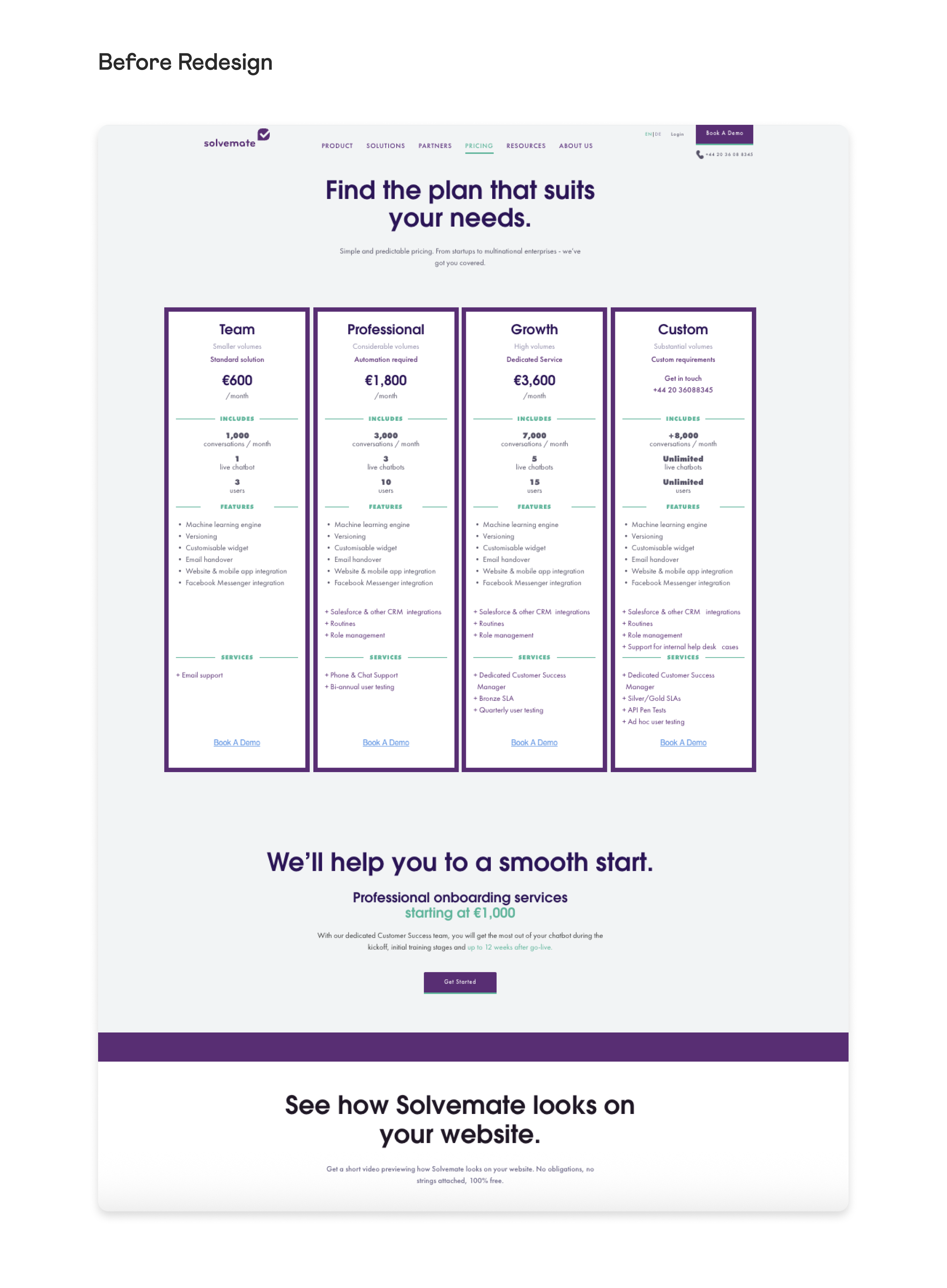
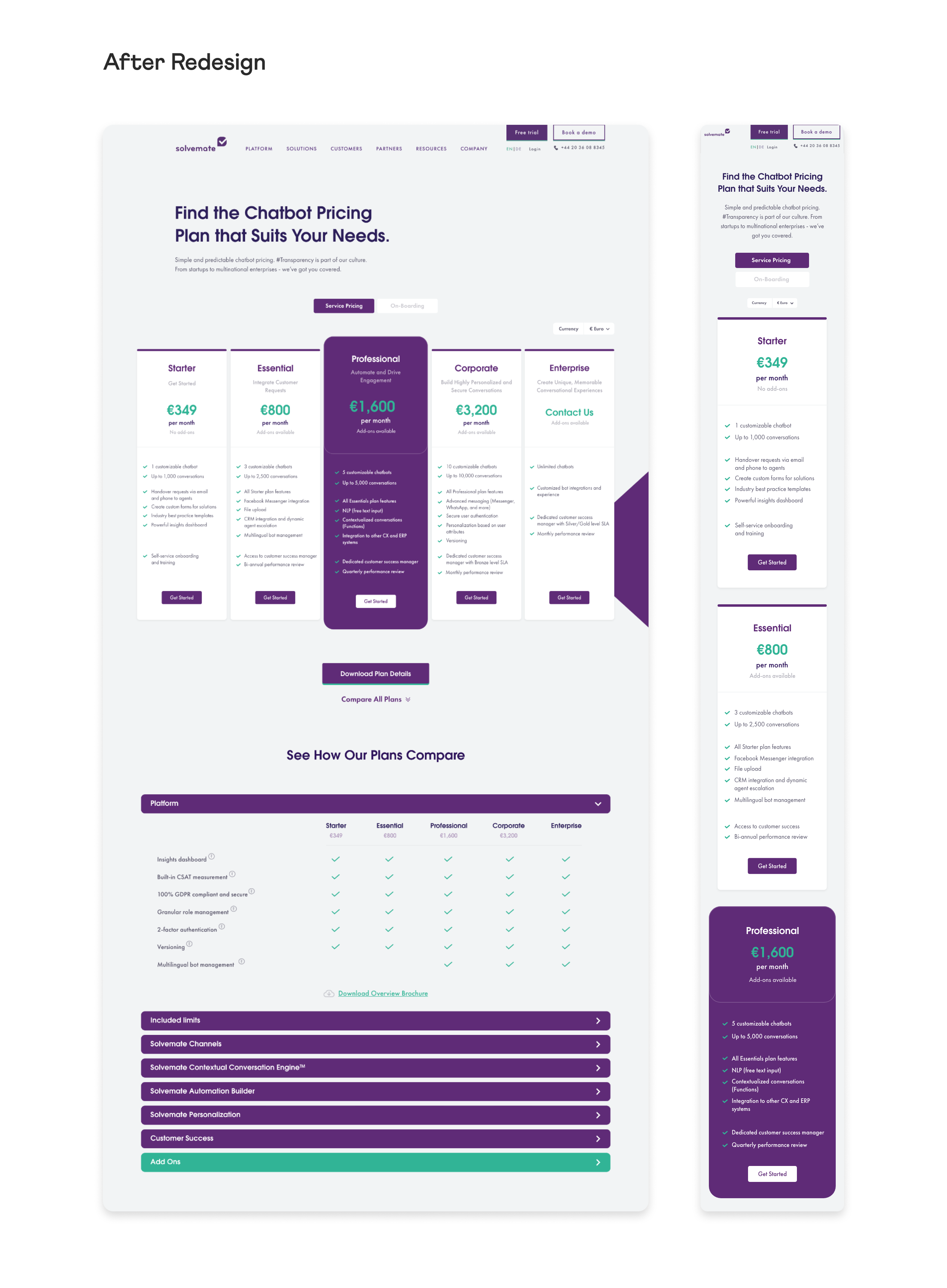
Solvemats’s previous pricing page listed four plans with minimal bullets and a single CTA. After a pricing overhaul, the Commercial team needed to communicate inclusions, limits, add-ons, and definitions that the old page couldn’t handle. As Designer, I redesigned Solvemate’s pricing page to support far more granular plan details—moving from a simple 4-card layout to a comparative system with a feature matrix, grouped accordions, and tooltips. The result lets visitors scan at a glance and open depth only when needed, while staying on-brand and conversion-focused.
Snapshot
- Role: Graphic Designer (UI/UX)
- Partners: Content Marketing, Commercial, External Web Agency
- Tools: Adobe XD
- Deliverables: Responsive pricing designs (desktop & mobile), feature-comparison matrix, grouped accordions, annotated XD handoff, PDF exports
Challenge
Accommodate more information (plans, features, limits, add-ons, definitions) without more cognitive load—and keep conversion paths clear across desktop and mobile.
Approach
- Best-Practice Audit: Studied successful SaaS pricing patterns to identify effective structures and layouts.
-
Content Alignment: Partnered with Commercial and Content teams on naming, clarity, and copy length for readability.
-
System Consistency: Applied the updated type scale, spacing, and components from the new homepage for brand cohesion.
-
Handoff & QA: Delivered annotated XD files and supported the external agency through build and responsive testing.
Outcomes
The new design transformed the pricing page from a simple list into a guided selection flow that’s easy to scan and deeper when needed. Visitors grasp plan differences at a glance and reveal details only when they choose, which lowers cognitive load and boosts decision confidence. Clear CTAs, a highlighted recommended plan, and mobile-friendly behavior create a smoother path to conversion, while tooltips, add-ons, and downloadable plan details reduce “what’s included?” back-and-forth for Sales.
Link to Video on Dixa Website︎︎︎
Link to Video on Dixa Website︎︎︎
Key design decisions
- High-level first, depth on demand: Plan cards show value, price and 3–5 inclusions; deeper comparison lives below.
- A scannable check-mark grid grouped by category (e.g., Platform, Automation, Support) to compare tiers side-by-side.
- Detailed sections for limits, channels, engines/builders, personalization, success, and add-ons, keeps the page clean while exposing depth.
- Info icons clarify terms (e.g., compliance/SLA concepts) without bloating copy.
- Currency control makes pricing relevant by region and reduces Sales back-and-forth.
- “Download Plan Details” and an overview brochure support procurement workflows.
- Stacked cards for scan-ability and a sticky plan summary/CTA during deeper sections so users never lose the next step.