
About︎︎︎
CONCEPT CONCEPT CONCEPT CONCEPT CONCEPT CONCEPT CONCEPT
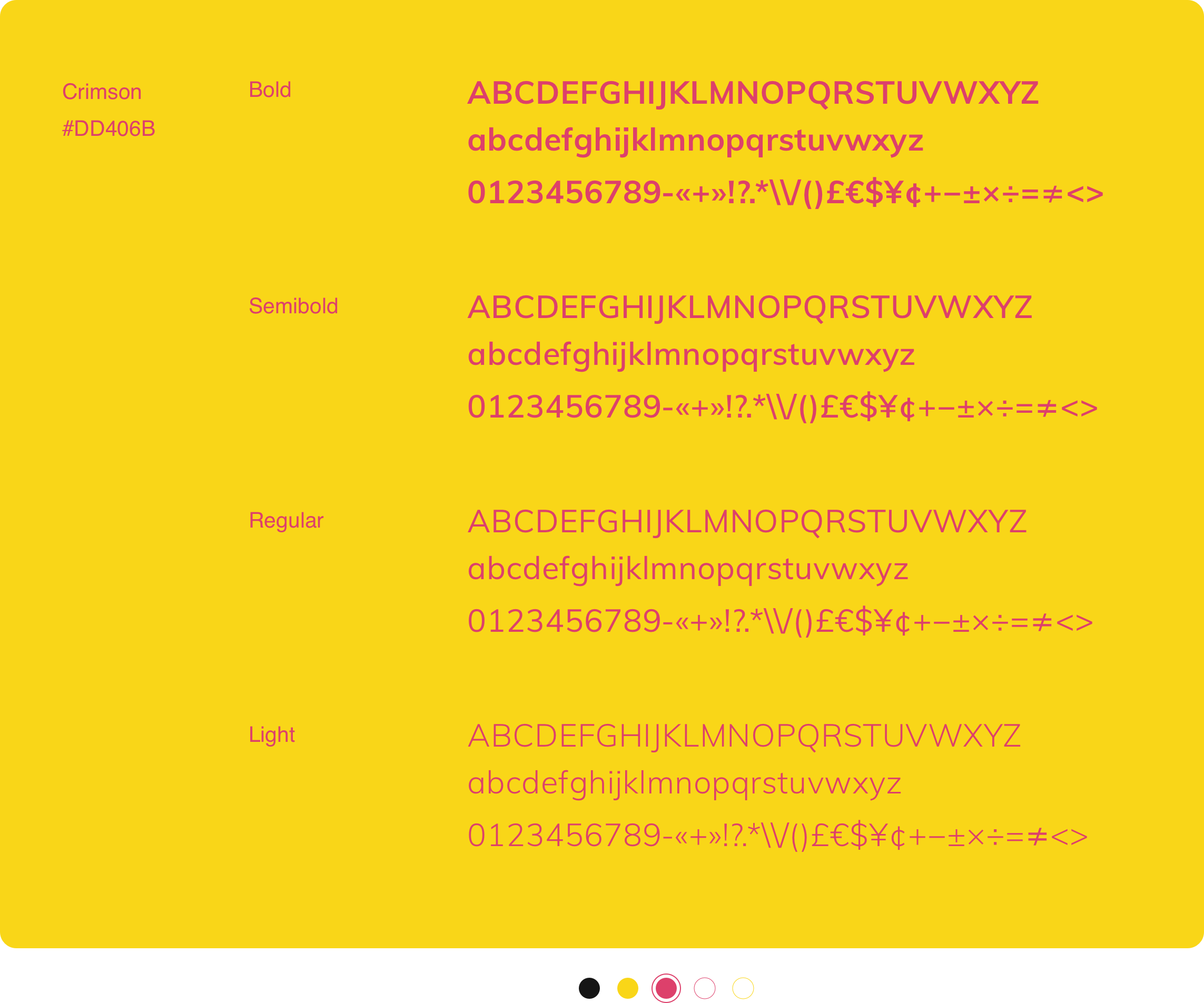
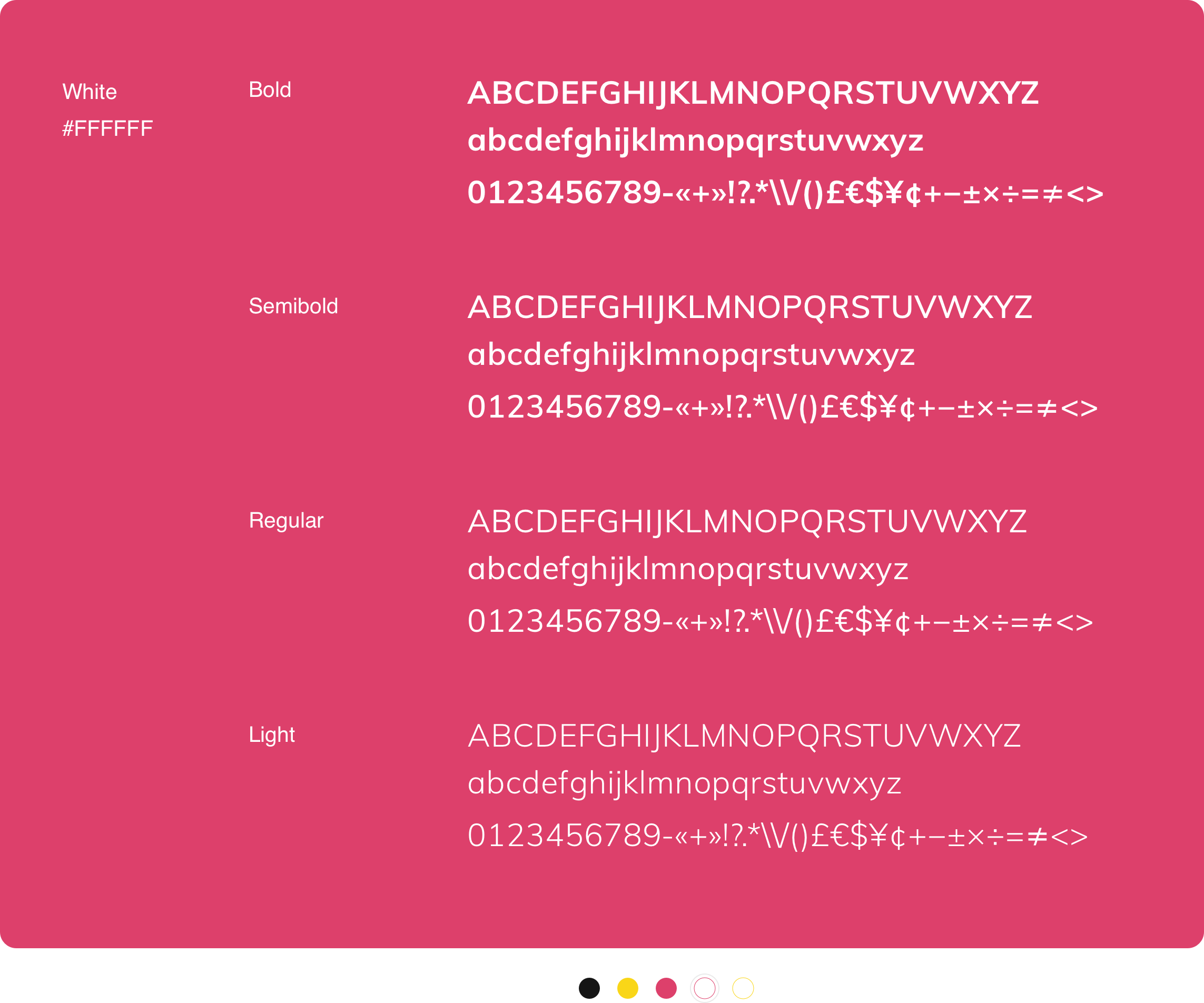
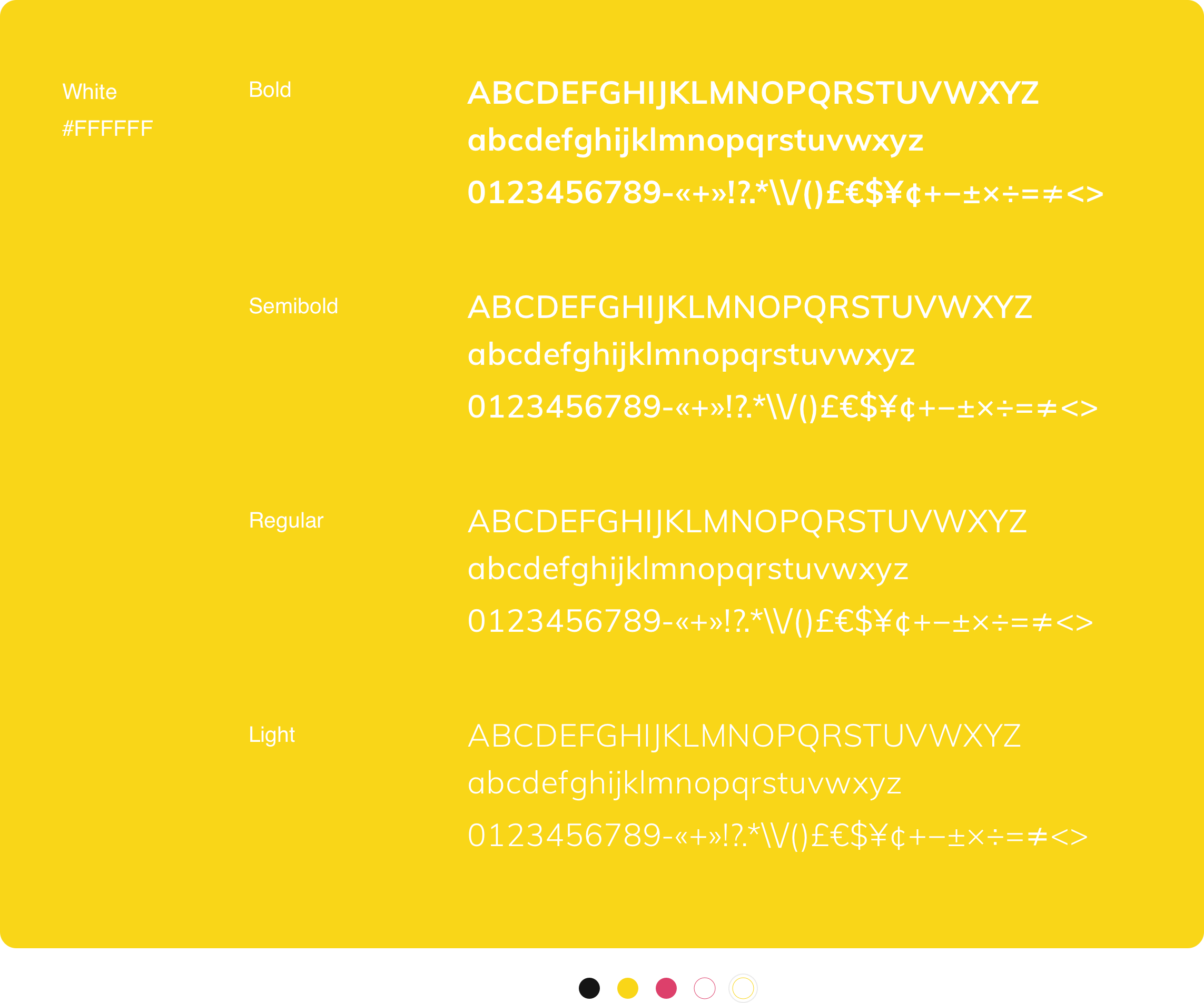
Color
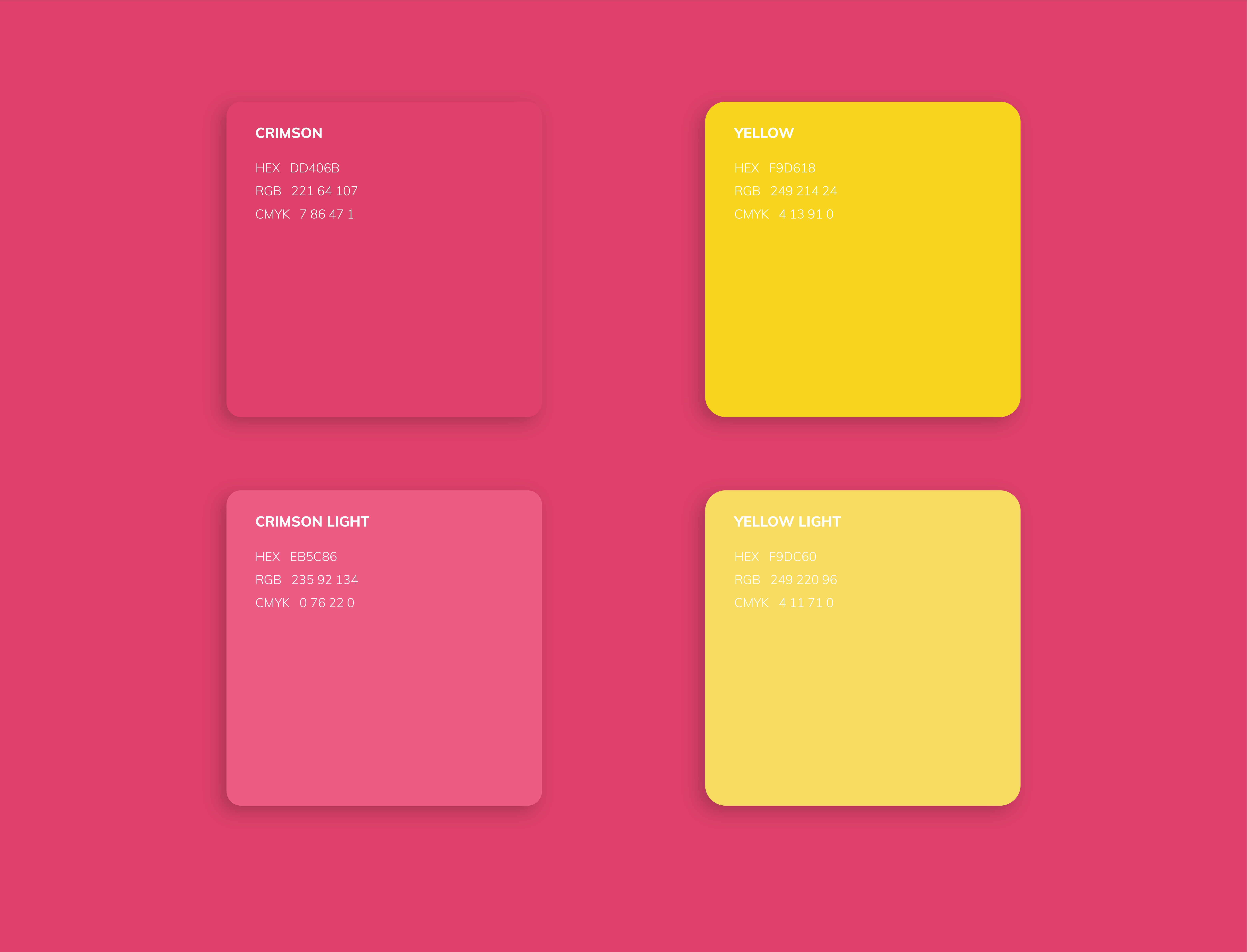
To communicate youth and playfulness, I wanted to use bold colors while limiting the palette to two colors so as to maintain consistency and trust.
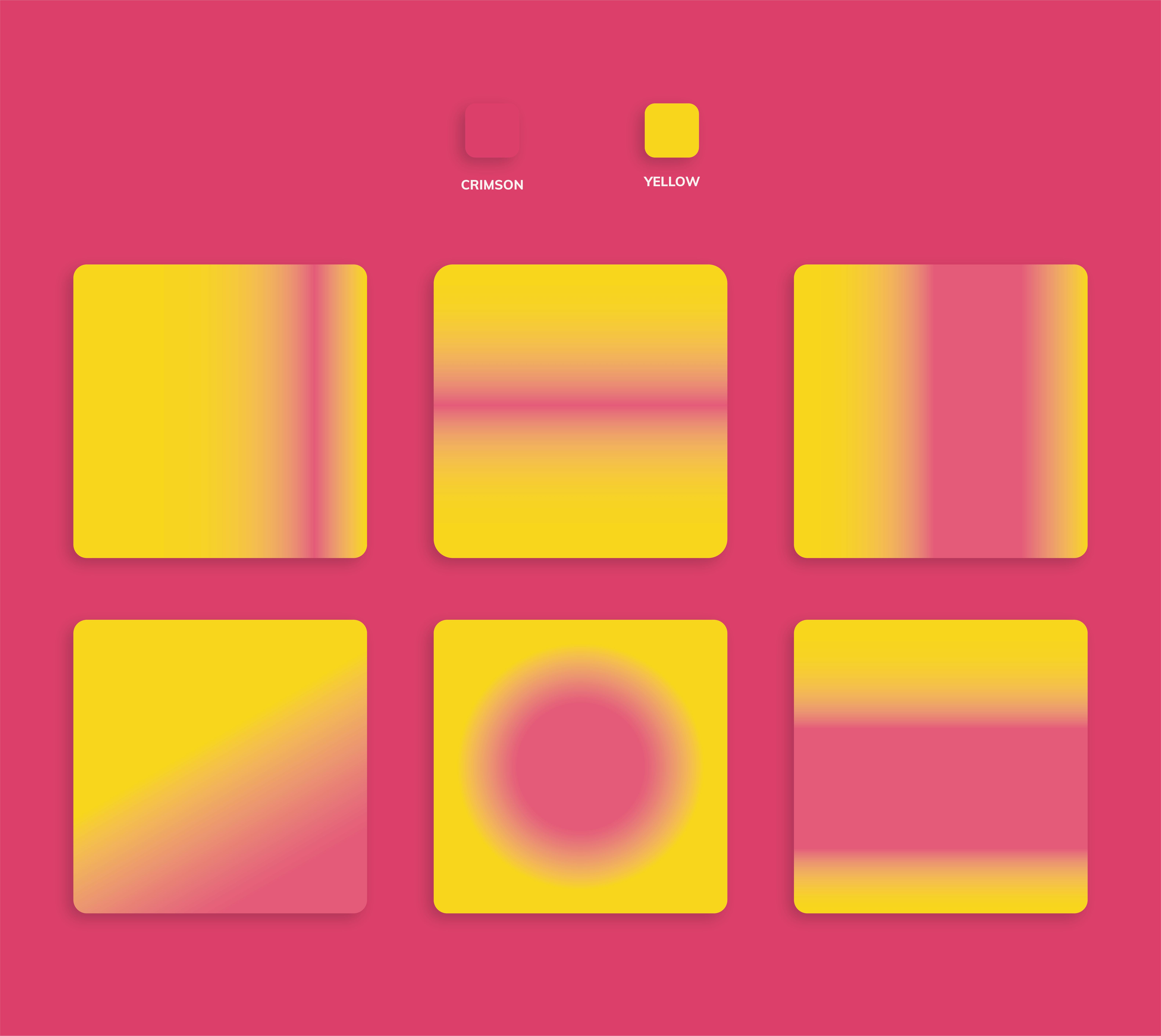
I picked shades of yellow and crimson to keep a balance between calm yet passionate personalities. Gradients would be used for compelling backgrounds.
Typography

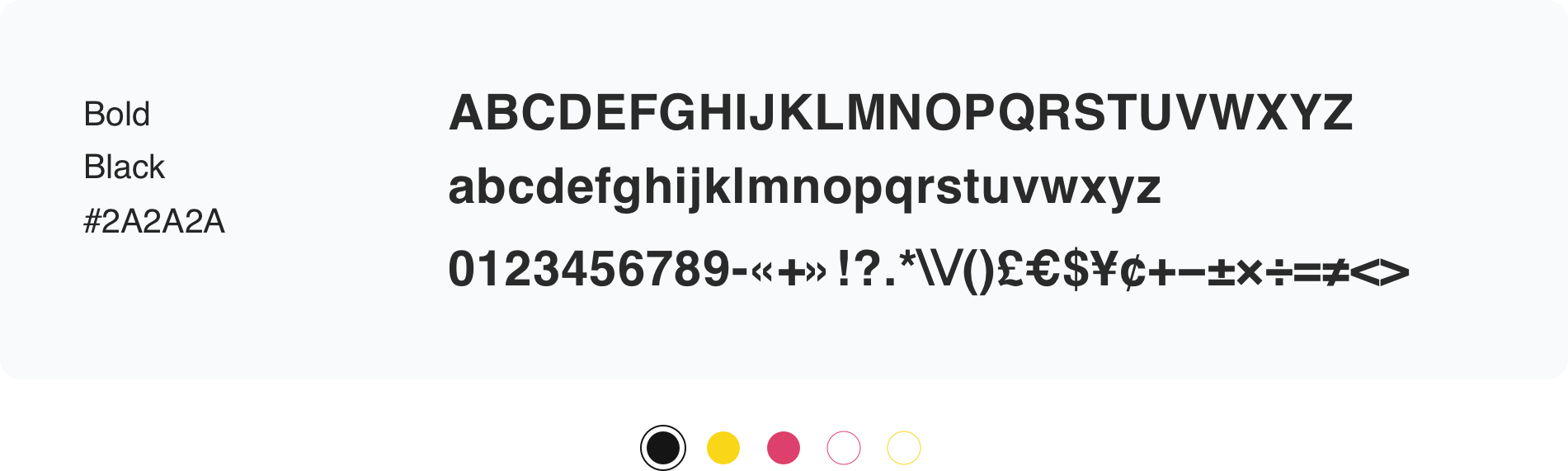
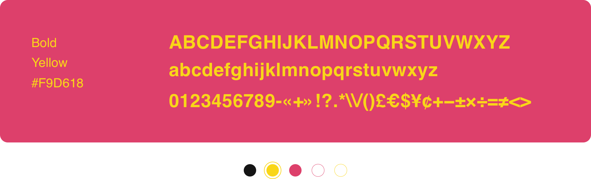

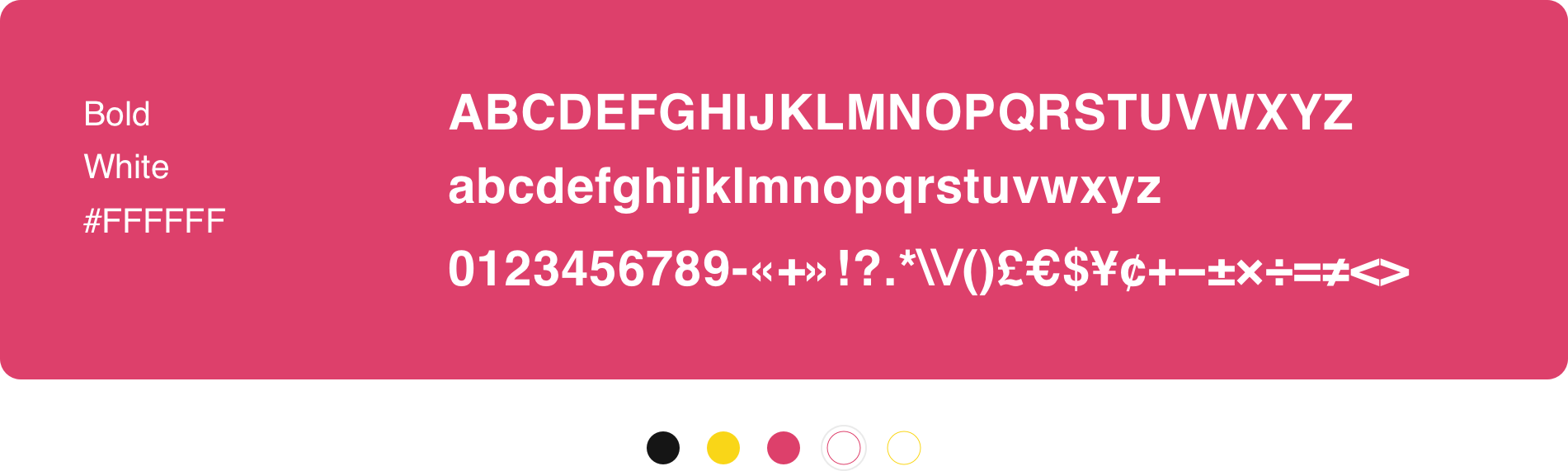
Helvetica
Helvetica is the typeface used for for large and brief headlines.

Usage
Set leading between 120–150%. Exceptions can be made for large headings above 50pt in print applications and 50px onscreen.
Never use below 50pt in print or 50px onscreen.
Type is usually left-aligned or centered. Never use fully justified. Text should never be hyphenated.
If your text is longer than 10 words, it’s best to use Muli instead.
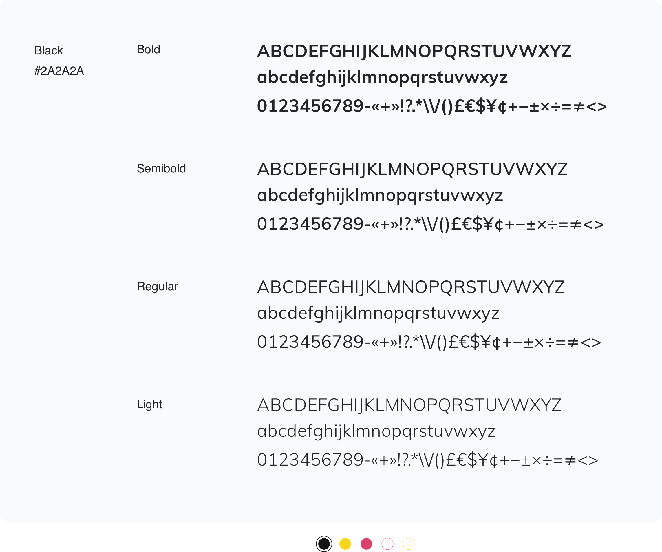
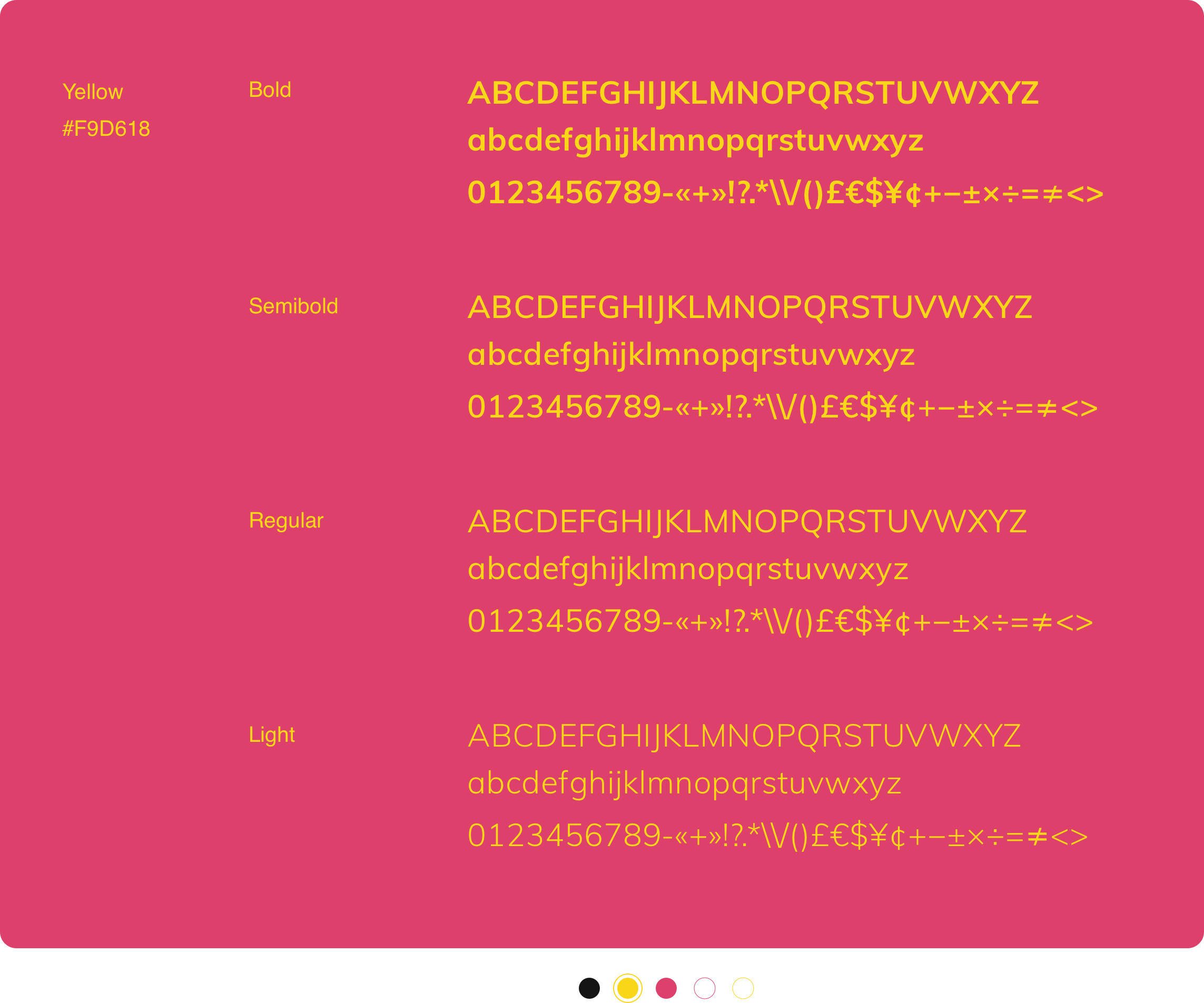
Muli
Muli is the typeface used for headlines 10 words or longer, subheadings and body copy.
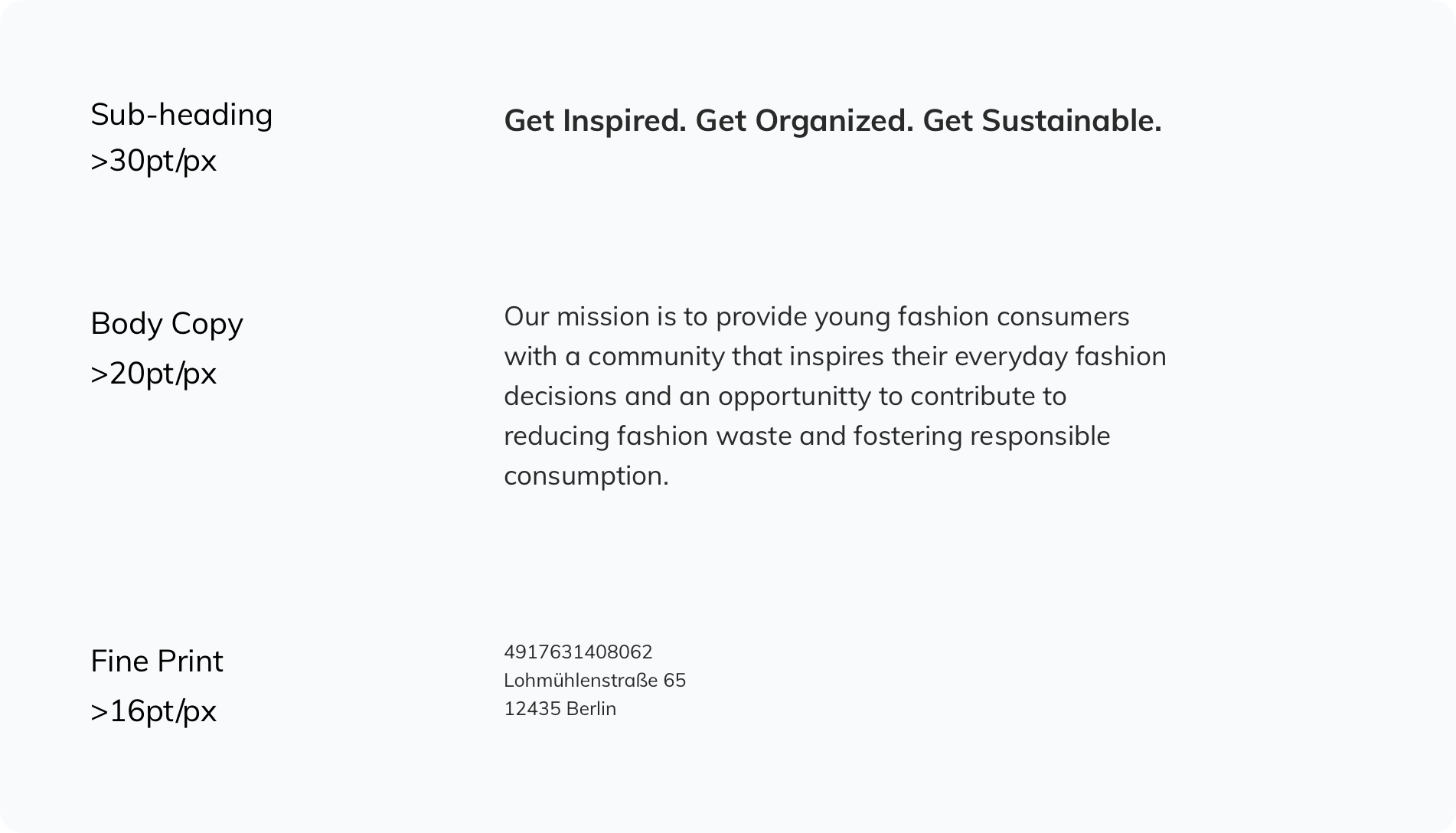
Usage
Set leading to 120–150%. Exceptions can be made for large headings above 30pt in print applications and 30px onscreen.
Never use below 16pt in print or 16px onscreen.
Type is usually left-aligned or centered. Never use fully justified. Text should never be hyphenated.
Set leading to 120–150%. Exceptions can be made for large headings above 30pt in print applications and 30px onscreen.
Never use below 16pt in print or 16px onscreen.
Type is usually left-aligned or centered. Never use fully justified. Text should never be hyphenated.

Combination
When using Helvetica and Muli together:
Always align left.
Aim to use Helvetica 150% larger than Muli.
Bring the two fonts together by using equal leading throughout the block of copy when possible.
Do not combine the two fonts within the same sentence.